Do you keep track of your travel statistics? Do you have a spread sheet where you record your miles traveled, a Google map with your route, or a budget where you compile campground fees? How about a super cool interactive infographic with details about where you’ve been, how much you’ve spent, and how far you’ve driven?
Introducing the brand new Watsons Wander Interactive Travel Infographic.
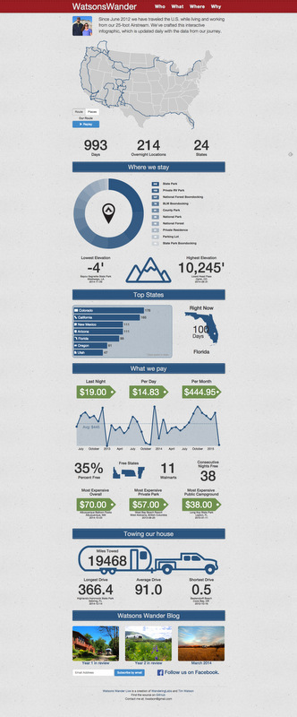
Since the start of our journey (993 days ago) Tim has been keeping track of a bunch of statistics pertaining to things like how much we pay per night, what kind of campgrounds we stay at, and how far we drive. In an effort to present the data in an interesting and informative way, he spent the last month or so making a creative and interactive infographic that complies all the data into a neat, functional, auto updating set of graphs and visuals. To get the full feel of this very cool infographic head on over to live.watsonwander.com where you will see the graphics come to life. I’ll wait here…
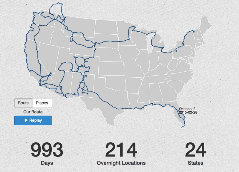
Okay, now that you’ve seen it in action, let’s talk a little about each section. Starting with the map. This map depicts our entire route for the past 2 years and 9 months. Every time we move somewhere new Tim updates our location and the line on the map grows longer. As you noticed over on the Live Page the route is animated allowing you to follow along as we travel from Vermont to Florida.
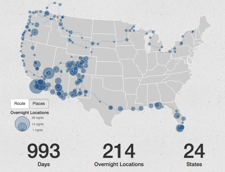
The map also has a places feature. From the Live Page simply click on the Places button and the route is now populated with bubbles of varying size. Each bubble represents a place where we have stayed. The size of the bubble corresponds with the length of time we spent there. If you hover your mouse over a bubble the name of the town, campground, and length of stay pops up. You will notice that in certain states where we stayed in a lot of places (such as Colorado) the bubbles over lap each other and it is nearly impossible to click on each one. Keep in mind that this map is more of a representation of how long we have stayed in each spot rather than a complete resource. Check out our Where Page to view clickable maps for each year along with a complete list of every place we have been.
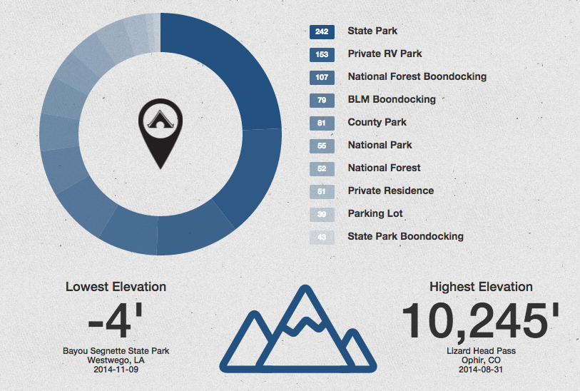
Below the map is the Wheel of Places. Here you will find a break down of the different types of campgrounds and boondocking spots where we’ve stayed. State parks are currently in the lead with 242 nights. On the Live Page hover your mouse over each section of the wheel to see the percentage for each type of park. As of today state parks come in at 24%, followed by private RV parks at 15%, National Forest Boondocking at 11%, and so on.
Also, note the elevation section. From -4 to over 10,000 feet. That’s quite a difference!
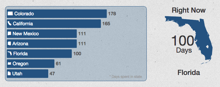
Next we have our top states. Colorado is in the lead with California not far behind. As you can see we’ve been in Florida for the past 100 days. Will it beat out New Mexico & Arizona for 3rd place? Check back in 12 days to find out.
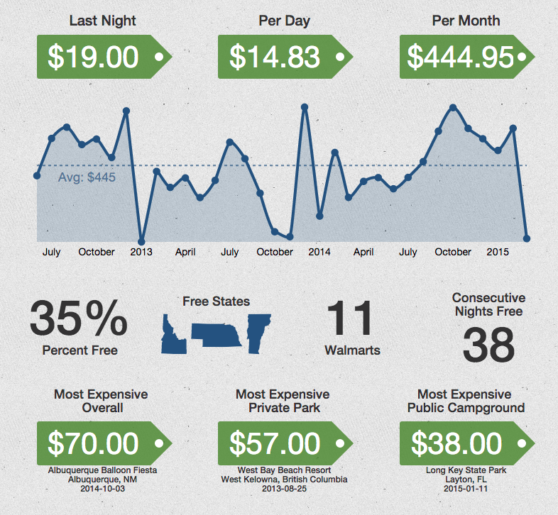
Now we come to the money section. Here you will see a bunch of data pertaining to how much we pay at campgrounds including daily and monthly averages. On the Live Site hover over each point on the graph to see the monthly average for that month. It’s interesting to note the huge ups and downs. So far our most expensive month was December of 2013 where we spent $784 (San Diego,) and our least expensive January of 2013 (boondocking in CA & AZ) where we spent nothing.
The next section complies the data on where we’ve stayed for free, including three states where we never spent a dime on camping fees.
In contrast to free we have the most expensive places we’ve stayed. Onsite camping at the Balloon Fiesta as part of an Airstream rally, a private park in British Columbia with a small Airstream caravan, and the always gorgeous Long Key State Park. All three were well worth it in our opinion.
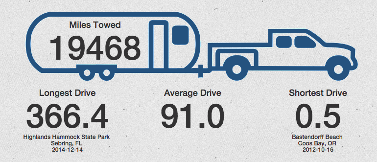
Finally, we come to the miles towed section. Here you can see our overall miles traveled (with the Airstream only – side trips don’t count), our longest drive, our shortest drive, and our average drive length.
Thats’s it! 983 days of Airstream travel. Eventually we will have a direct link from the side bar of the blog to the Live Infographic Page. For now simply go to live.watsonswander.com to see it. The infographic updates automatically daily so be sure to check back often to see our progress.

21 comments
Okay… you’ve hooked me! How do I get this software for my own use?
It’s coming soon! Tim is working on making this infographic, along with a version of the map on our Where page, available for others. We’ll let you know when it happens.
Yay!
Looks amazing! Can’t wait to buy a version so we can track our own journey. Thanks for creating and sharing!
You should consider setting this up as an online service so people can track their own travels. I suspect there are others who would love something like this.
Tim’s on it. It might be a few months (his real job gets in the way of fun stuff), but eventually he will offer this for others as well.
Super cool! Love, love love! What a fun summary of your travels
Very cool. Please let me know when it’s available for public consumption. I love it!
This is fabulous!! Tim, you are amazing!! Two drop dead hits in a row. Hope your employer appreciates you as much as I do.
I’m in love with it also! Most everything in one place and interactive. Great job! Looking forward to purchasing it also! I love when I don’t have to do the math myself!
Yes! No math is always a good thing :)
I can’t wait for you to make it available for purchase! I love this stuff! -Linda
Way cool! Tim is one talented web dude!
Tim is an extremely talented web dude! Way to be, Tim!
Very Cool.
I’d be happy just to find a simple mapping program. Anybody know a good one? I thought it would be nice to add or merge other google map co-ordinates together with good camping and boondocking sites, and also be able to add my own. It would be cool to have info bubbles that could show the campground name, phone number, website, price, etc. Seems like this should be able to be done with google maps reasonably easy…
AWESOME!!!
Interesting fact derived from your info-graphic: you are averaging roughly 20/miles a day.
Hmmm…that’s about 30 miles less per day then we each used to commute for work. And this is way more fun!
Oh please make it available for sale. My hubby tracks all of this and he would think this is way cool!
Want!! Please notify me when the tracking thingy goes retail. Thanks!
This is amazing!! You are both so creative in so many ways.